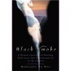
Earlier today I came across Eva Maria Staals Try the Morgue, the design of which reminded me of John Greens Looking for Alaska (review). I did a bit of browsing, and found that smoke spirals are a relatively popular design element. In general, the motif seems to be incorporated into otherwise simple designs; the colour palette is usually a pale smoke tendril on a dark background, although sometimes a light background is used as well.
Smoke as a design element does seem to work on a number levels. Visually, its ethereal and soft, adding texture and depth to what might otherwise be a stark image. In terms of its symbolism, you can take your pick, really, but theres certainly a sense of life and death, transformation, disappearance or loss, spirituality or religious themes, and wish fulfilment, or lack thereof.
Below are some of the examples I found:
These next few covers feature the smoke motif, but each with a different take.'Warm Bodies (review) features a design thats actually veins and capillaries, but that gives the sensation of smoke;'You Wish incorporates the smoke into its title typography.'The Leftovers, on the other hand, incorporates smoke almost as a subject, rather than an object or symbol.
Have you come across any smoky book covers in your travels? What are your thoughts on them?


Smoke is the new girl in a ball dress/headless girl/photo of a jar?
Another interesting variation of the smoke theme: Please Ignore Vera Dietz by A.S. King:
http://www.goodreads.com/book/show/6665671-please-ignore-vera-dietz
Oh, rats, you beat me to my post on jars. ;) I did have another current trend (or two) in mind, but this one caught my eye, so I thought Id pop it up first. Cancer issues aside, though, Id take this over a dead girl in a dress any day!
Thanks for the AS King cover, too. Its a striking composition, and definitely an interesting take on the idea. :)
Hmm. I had never really considered smoke to be a regular occurrence on book cover, but reading your post changed my mind. I can remember several more covers now that have some form of smoke and something smoke- like on their covers. I like it. It is a very simple design but it can definitely evoke quite a few emotions or reactions. I am going to keep my eyes out for more smokey covers from now on. Thanks for the post!
My pleasure, Jaime! Ive definitely seen plenty more that incorporate a hint of smoke, or some sort of smoke-like tendril into their covers, but I was surprised by how many there were that used simply the smoke spire theme. I wonder whether its partly to do with the shift to ebooks, where cover design has to be fairly simple in order to display well on a screen.
So interesting! I will be on the look out for covers with the smoke theme!
susan recently posted..This Month's Book:And When She Was Good By Laura Lippman
Thanks, Susan! Let me know if you find any in your travels. :)